Adding light mode exposed my fake theme system
Musclog had a theme system long before it had themes.
There was a theme.ts, components called useTheme(), and a dark palette that had slowly replaced most of the literal colors in the app. On paper, the difficult work was already done. Adding light mode should have meant duplicating a palette, changing the hex values, and putting a selector in Settings.
That is roughly how it started. It is not how it ended.
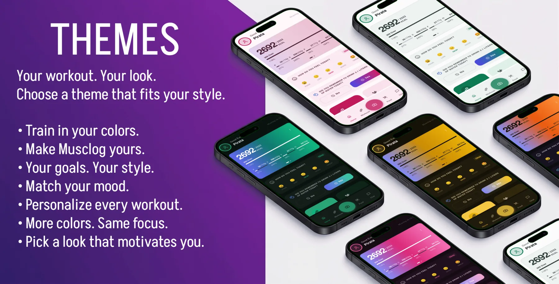
The moment the app could switch between Kinetic Depth, Kinetic Light, Kinetic Shock, Kinetic Volt, and Kinetic Blush, every shortcut that had been harmless with one palette became visible. Some components followed the selected theme through inline styles. Others followed NativeWind’s binary dark mode. Portalled modals lived outside the View carrying the variables. Camera controls needed to stay light even when the app became light. One card had quietly decided that “light mode” and “do not use a gradient” were the same fact.
The colors were the easy part. The real job was making the app have exactly one answer to a deceptively simple question:
Which theme is this pixel using?
One palette became four representations
A React Native app styled with NativeWind has two color systems whether you want one or not.
Inline styles need actual values:
const theme = useTheme();

<View style={{ backgroundColor: theme.colors.background.card }} />;
NativeWind classes are compiled ahead of time, so they need CSS custom properties that can be swapped later:
<View className="bg-bg-card" />
That class eventually resolves to something like:
background-color: rgb(var(--c-bg-card) / 1);
On native there is another wrinkle. NativeWind’s runtime wants opaque colors as parsed RGB channel tuples, while web wants CSS strings. The same #131d18 therefore becomes "19 29 24" in generated CSS and [19, 29, 24] in the native variable map.
My first implementation had a map for semantic theme objects, a map for web variables, a map for native variables, a list of valid IDs, and a function mapping IDs back to light or dark. They contained the same four keys, maintained by hand, in different files.
That works until the fifth theme. Then one map is forgotten and half the UI changes color while the other half does not.
So the theme system now begins with one boring plain-JavaScript registry:
const THEME_DEFINITIONS = {
  'kinetic-depth': {
    mode: 'dark',
    palette: {
      surfaceBase: '#091310',
      surfaceCard: '#131d18',
      textPrimary: '#dce5de',
      brandPrimary: '#29a577',
      // ...the rest of the primitive palette
    },
  },
  'kinetic-blush': {
    mode: 'light',
    palette: {
      surfaceBase: '#fff7fa',
      surfaceCard: '#fbe9f1',
      textPrimary: '#2b101d',
      brandPrimary: '#c2185b',
    },
  },
};

const THEME_IDS = Object.freeze(Object.keys(THEME_DEFINITIONS));

const DEFAULT_THEME_BY_MODE = Object.freeze({
  dark: 'kinetic-depth',
  light: 'kinetic-light',
});
DEFAULT_THEME_BY_MODE is small and easy to skip past, and it was the last thing I fixed. “Which theme does light mean?” had been written out in five different files: the System resolver, the legacy-preference migration, the darkTheme/lightTheme aliases, the pre-boot color set, and Tailwind’s base variables. All five agreed, which is exactly what makes that kind of duplication survive review.
It is JavaScript rather than TypeScript for a practical reason: Metro consumes it for the app and Node consumes it while Tailwind builds the stylesheet. Making either side maintain a translated copy would put the duplication straight back.
Everything else is derived. ThemeId comes from the registry keys. The semantic token tree comes from each primitive palette. The React theme map, CSS variables, native variables, and light/dark mode all iterate the same list.
export type ThemeId = keyof typeof THEME_DEFINITIONS;

export const THEMES = Object.fromEntries(
  THEME_IDS.map((themeId) => [themeId, createTheme(themeColorsById[themeId])])
) as Record<ThemeId, Theme>;
The type assertion is at the boundary where Object.fromEntries forgets the exact keys. The rest of the app gets a proper Record<ThemeId, Theme> and cannot ask for a palette that does not exist.
Primitive colors are not component colors
The registry does not define background.card directly. It defines a small primitive palette by role: base surface, card surface, raised surface, three text levels, brand colors, status colors, and a few fixed-purpose inks.
One function expands those primitives into the large semantic tree the app already uses:
function createColors(palette) {
  return {
    background: {
      primary: palette.surfaceBase,
      card: palette.surfaceCard,
      cardElevated: palette.surfaceRaised,
      overlay: palette.surfaceTint,
    },
    text: {
      primary: palette.textPrimary,
      secondary: palette.textSecondary,
      tertiary: palette.textTertiary,
      onAccent: palette.inkOnAccent,
    },
    accent: {
      primary: palette.brandPrimary,
      // ...
    },
  };
}
This is the distinction that made light mode possible without painting every screen individually. A component asks for the job a color performs, not the hue it happened to have in the original dark design.
That key used to be called text.black, which is a good example of the problem in miniature. Its job is “ink on a solid accent”. In the dark emerald theme that ink is near-black. In Kinetic Light and Kinetic Blush, whose accents have to become darker to stay visible on a bright surface, it is white. A name describing the hue was wrong in three of five themes; a name describing the role is right in all of them.
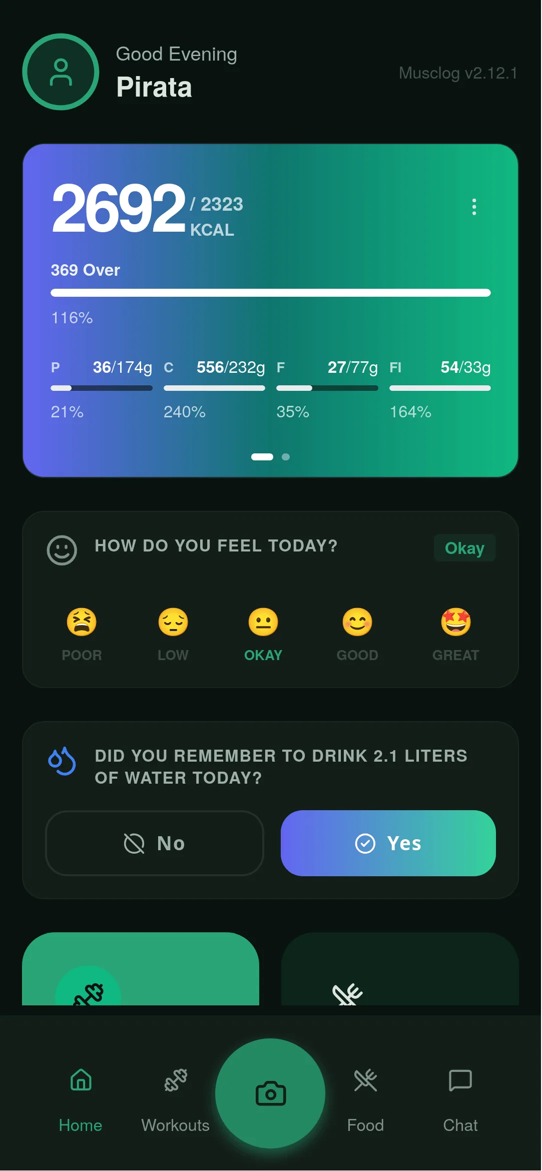
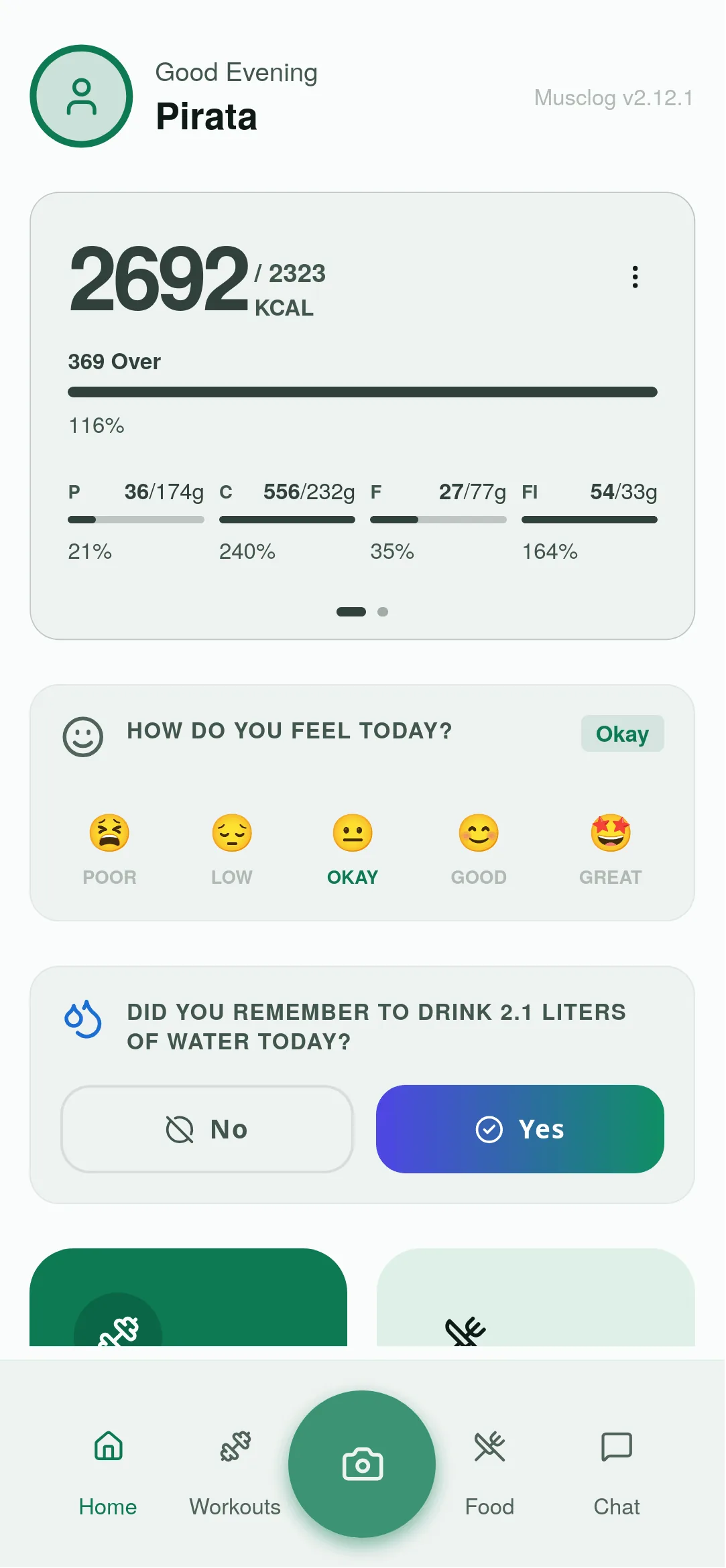
The two screens above are the same components with the same class names. Nothing in DailySummaryCard, the mood picker, or the tab bar knows which of them it is rendering.
The same applies to translucent borders. border-white/10 looks reasonable on dark green and disappears completely on white. border-ink/10 means “ten percent of the current on-surface ink”, which survives both.
Resolving “System” once
There are seven choices in Settings but only six palettes. “System” means Kinetic Light when the operating system is light and Kinetic Depth otherwise.
Originally, each hook resolved that independently:
export function useTheme() {
  /* read settings, read Appearance, resolve */
}
export function useThemeMode() {
  /* read settings, read Appearance, resolve */
}
export function useThemeId() {
  /* read settings, read Appearance, resolve */
}
Then ThemeProvider called all three and read Settings again for NativeWind. One render could subscribe to the same database-backed setting four times. Worse, the hooks did not actually read the provider they appeared to belong to. The provider was mostly a delivery mechanism for a value everybody had already calculated themselves.
Now resolution happens at the root:
export function ThemeProvider({ children }: { children: ReactNode }) {
  const { theme: preference } = useSettings();
  const systemColorScheme = useColorScheme();
  const themeId = resolveThemeId(preference, systemColorScheme);
  const value = useMemo(() => valueForTheme(themeId), [themeId]);

  return (
    <ThemeContext.Provider value={value}>
      <View style={[{ flex: 1 }, THEME_VARIABLES[themeId]]}>{children}</View>
    </ThemeContext.Provider>
  );
}
And the public hooks are deliberately dull:
export const useTheme = () => useThemeContext().theme;
export const useThemeId = () => useThemeContext().themeId;
export const useThemeMode = () => useThemeContext().themeMode;
That dullness is the feature. Inline styles, status-bar mode, named palette identity, and NativeWind variables all begin with the same resolved ID in the same render.
On web the provider also writes the selected variables to document.documentElement. React portals render modals under <body>, outside the provider’s View; without root variables, opening a modal could jump back to the default palette. The effect removes those inline properties on cleanup so a remount cannot inherit stale colors.
The camera is not a dark-mode component
The camera caused the most interesting exception.
A viewfinder is visually dark because it is a photograph with a scrim over it, not because the user’s preference is dark. Its white shutter, close button, and scanning frame must remain visible in Kinetic Light.
My first answer was a separate ForcedThemeContext. useTheme() checked that context before the real one, while a wrapper View installed dark NativeWind variables. It worked, but it created two authorities: the normal provider and the forced provider. A component could read one while its className descendants inherited the other.
The replacement is a general named scope:
export function ThemeScope({ themeId, children }: ThemeScopeProps) {
  const value = useMemo(() => valueForTheme(themeId), [themeId]);

  return (
    <ThemeContext.Provider value={value}>
      <View style={[{ flex: 1 }, THEME_VARIABLES[themeId]]}>{children}</View>
    </ThemeContext.Provider>
  );
}
The camera surface uses <ThemeScope themeId="kinetic-depth">. Context tokens and NativeWind variables enter and leave the scope together. The modal around the camera still follows the user’s choice; only the viewfinder pins the palette it actually needs.
That boundary matters. “This feature is always dark” spreads quickly. “This photographic surface owns a dark visual environment” is precise enough to stay contained.
It took me a second pass to actually believe my own abstraction. The first version installed the scope and then, in the same component, wrote const theme = darkTheme and read the palette straight out of the module. It rendered correctly, because the two happened to agree — which is the worst possible outcome, since nothing would have told me when they stopped. The shell now renders a body component inside the scope, and that body calls the same useTheme() as every other component in the app:
export function SmartCameraShell(props: SmartCameraShellProps) {
  return (
    <FullScreenModal /* ... */>
      <ThemeScope themeId="kinetic-depth">
        <SmartCameraShellBody {...props} />
      </ThemeScope>
      {props.permissionGranted ? props.children : null}
    </FullScreenModal>
  );
}
The children sitting outside the scope is deliberate: those are the nutrition detail modals that open on top of the camera, and they are ordinary app surfaces. Having to write that as a separate line, rather than as a comment explaining a nested View, is what made me notice it was a decision at all.
The same subtlety bites one level down. The button beside the shutter was built as a value in the modal’s own body, outside the scope, so its useTheme() resolved to the app’s palette even though the element rendered inside the viewfinder. A hook runs where an element is rendered, not where it was constructed. Making it a component instead of a variable was the entire fix.
Light mode is not a component API
The Daily Summary card looked good with a saturated gradient in every dark palette and muddy in Kinetic Light. The first fix asked the current mode:
const backgroundVariant = themeMode === 'light' ? 'default' : 'colorful-gradient';
It is a tiny line and a surprisingly expensive assumption. It says every future light theme must use a plain card and every future dark theme must use a gradient. Display mode is about contrast defaults and system chrome; it is not a proxy for art direction.
So I moved the decision into the theme, as a component-level presentation flag:
<GenericCard backgroundVariant={theme.components.dailySummaryCardBackground}>
  {/* ... */}
</GenericCard>
Better. Kinetic Light chose default, the dark palettes chose colorful-gradient, and no component branched on the mode. I wrote a paragraph about it and moved on.
It was still wrong, and the tell was in the registry rather than the component. THEME_DEFINITIONS now contained a field named after one card. A palette is a description of color; summaryCardBackground is a description of DailySummaryCard. Adding a screen would mean adding a field, and the registry would slowly become a settings file for the whole app.
There was also a symptom I had not chased down. Kinetic Light still carried a colorfulCardBlend entry — the ratios that build the card’s gradient stops — and because the theme had opted out of the gradient entirely, those numbers were computed on every launch and rendered nowhere. Two mechanisms for one decision, and one of them silently dead.
The version I actually kept expresses the choice in the only vocabulary a palette has:
// kinetic-light
colorfulCardBlend: { start: 0, middle: 0, end: 0 },
At zero, every stop collapses to the card surface. The gradient is still a gradient; it is just flat, and it renders exactly like the plain card that the default variant produced. The component goes back to one unconditional line, the registry goes back to describing color, and the theme no longer knows that DailySummaryCard exists.
The idiom was already sitting in the same file, in a token I had written months earlier and forgotten:
landingBackground: [colors.surfaceBase, colors.surfaceBase, colors.surfaceBase],
A flat gradient. I had solved this problem once and then invented a whole new axis to solve it again.
Kinetic Blush is the argument for why this ordering matters. It is a light theme that does want the sweep — a pale lilac-to-rose wash instead of a flat card — so it sets real ratios and gets one. Under the flag design that would have been a second value in a two-value enum. Under this one it is three numbers in the same palette as everything else, and DailySummaryCard never learned its name.
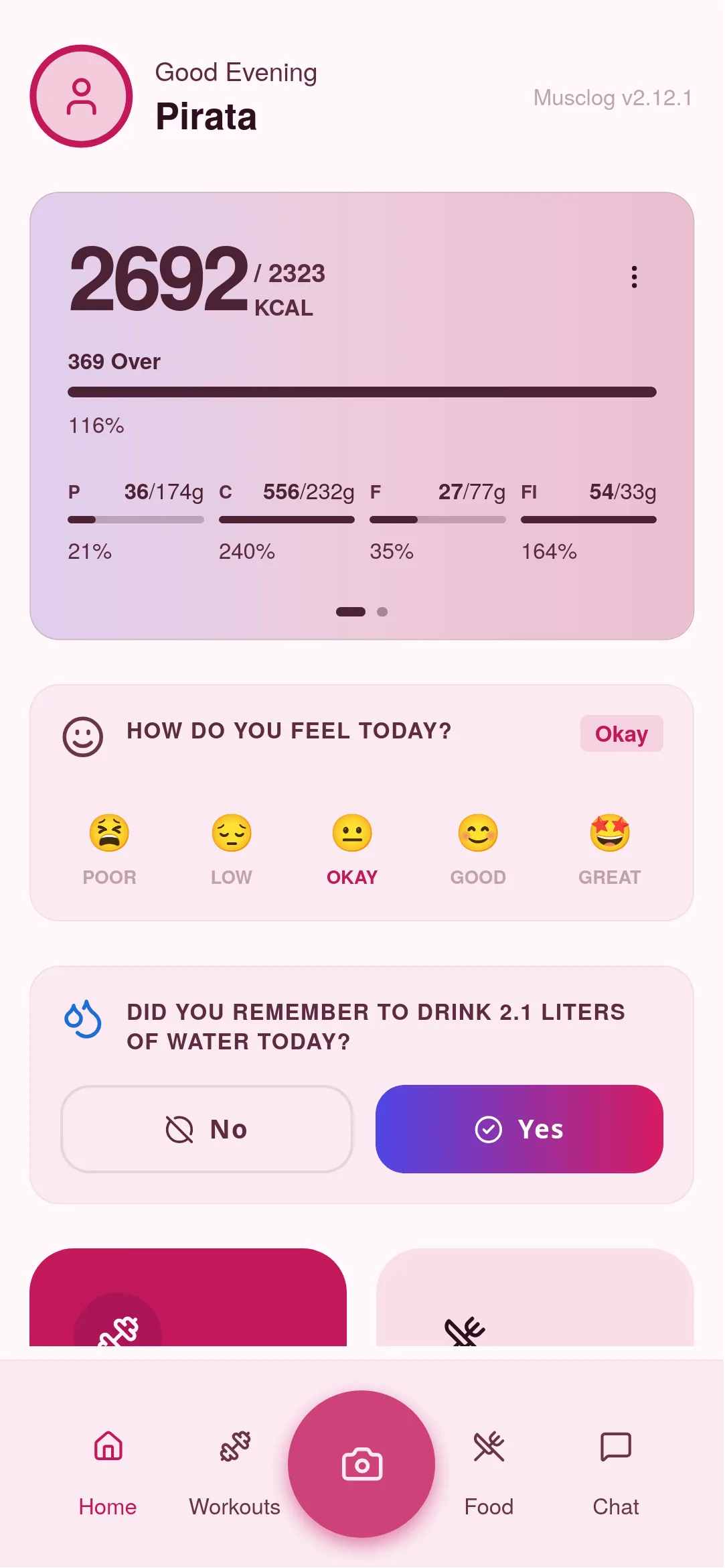
Blush is light and gradient. Kinetic Light is light and flat. Under the mode check, one of those two was unreachable.
Contrast is data, so test the data
Six palettes multiply the number of combinations faster than screenshots can cover. The durable checks iterate the registry instead of naming themes one by one: every rung of the surface ladder has to stay visible against the next, every text step has to clear AA on every ground that carries body copy, and no two colors that share a chart legend may land within a just-noticeable difference of each other.
I wrote all of that twice, which I did not notice until I went looking for something else.
There was a scripts/check-palette.js that read the registry and used chroma-js — a genuinely nice script, with a comment at the top explaining that it existed to stop the palette regressing. It was not wired into CI. Nothing ran it. Meanwhile the test suite, which does run in CI, contained a hand-rolled sRGB luminance function and its own copies of the ladder rule, the AA rule, and the thresholds. A third copy of the same fifteen lines of luminance math lived in the Daily Summary card’s test file.
So: two implementations of one guard, in two different vocabularies, with duplicated constants, and the weaker one was the only one enforcing anything.
The rules now live in theme.audit.js and nowhere else. The script prints them:
const problems = auditTheme(themeId);
CI asserts them:
it('passes the palette audit on every named theme', () => {
  expect(auditThemes()).toEqual([]);
});
Same function, same thresholds, and the readable report is now a view onto the thing that actually gates the branch rather than a parallel opinion about it.
Consolidating also made it obvious what was missing. Kinetic Volt has a bright gradient on the summary card and needs dark ink on it, which had been handled by a test naming Kinetic Volt specifically. That is fine until a sixth theme is bright too. The rule I could state generally is that the card’s ink must sit on one side of the whole sweep — lighter than every stop, or darker than every stop, never in the middle. Kinetic Blush passed it on the first try, which is the only reason I trusted the palette enough to ship it.
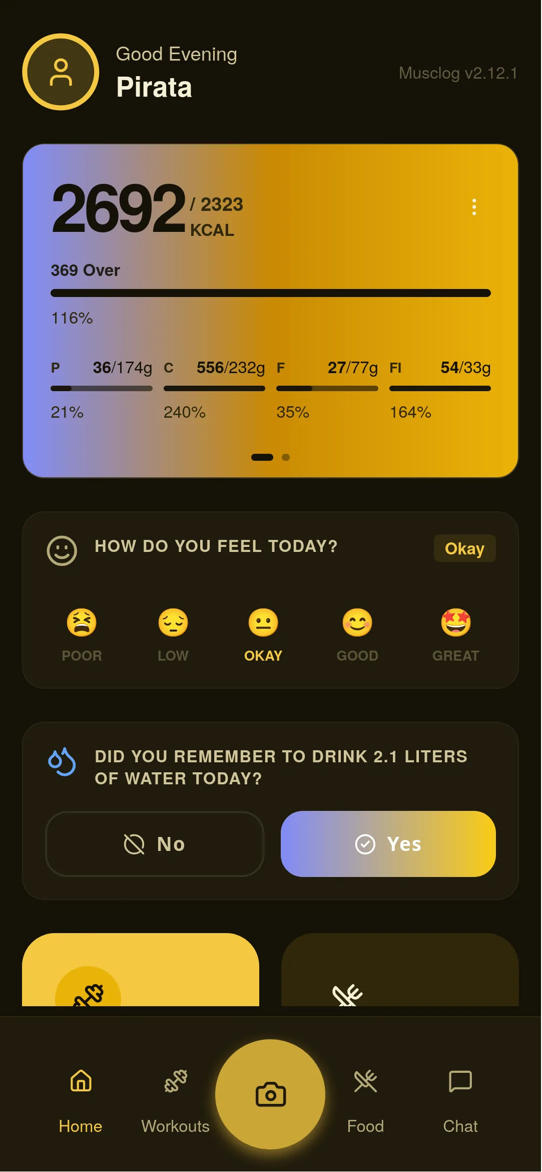
Volt is the case that made the general rule necessary: it is a dark theme, so the card ink defaults to light, and its gradient is bright enough that the default would have been unreadable.
Another integration test renders the provider and reads useTheme(), useThemeId(), and useThemeMode() in the same hook. It asserts that Settings is read once, System follows the OS, a nested scope overrides all three values together, and web variables disappear when the provider unmounts.
The useful property of registry-driven tests is that they expand automatically. Adding a fifth entry added it to theme construction, CSS generation, ID validation, shape checks, and the contrast matrix without my touching any of them. Forgetting the tests is harder because the catalogue is what tells the tests what exists.
Adding Kinetic Blush was, in the end, one object in one file, one icon in the picker, and a line of copy per language. The palette guard caught the one real problem: the brand color is pink, macros.carbs reads from the brand, and macros.fiber is status.pink — so the two would have been the same swatch in a shared legend. Kinetic Shock had hit exactly this and solved it by making its status.pink a fuchsia. Blush does the same with a magenta. I did not remember that precedent; the audit did.
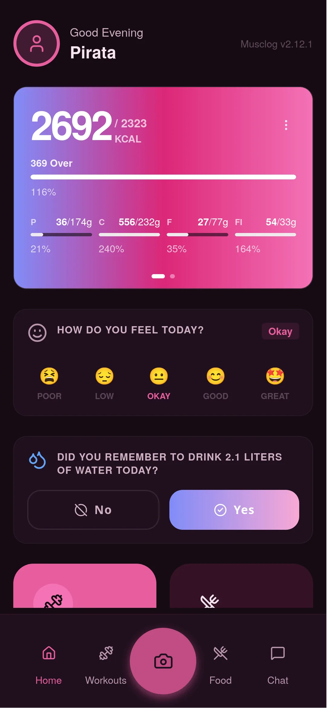
Kinetic Shock, where a pink brand color and a pink status color had to learn to be different pinks.
The code I deleted mattered too
The final pass removed an older theme selector hidden behind HAS_THEMES = false in the basic settings modal, plus debounced state and handlers that could no longer be reached. The real selector lives in Visual Settings.
Dead feature flags are particularly dangerous in a system like this. They look like documentation, so the next person copies the abandoned path and accidentally creates a second implementation. Deleting 100 lines of unreachable UI did as much for the architecture as adding the registry.
I also found a full package upgrade mixed into the theme branch, including patch-package files named for versions that were no longer installed. None of that was required to make a color yellow. It came back out, and the patches now apply to their exact locked versions without warnings.
That is the less photogenic half of building a theme system: reducing the number of unrelated things a reviewer has to believe at once.
What I would keep from this
The first lesson is that a theme is not a palette. It is a decision graph connecting stored preference, operating-system appearance, semantic roles, CSS variables, inline values, portals, and locally owned visual environments. If any of those resolves independently, the app has multiple theme systems even if they share a file name.
The second is that modes describe mechanics, not personality. Light and dark are useful for system UI and dark: variants. They should not decide whether one particular card gets a gradient. Put that choice in the theme data and let the component render it.
The third is the one I keep relearning: the best abstraction often has less intelligence at the leaves. useTheme() no longer knows how to resolve a preference. The Daily Summary no longer knows which themes like gradients — and, on the second pass, the theme stopped knowing that the Daily Summary exists. The camera no longer knows about a special forced context, and no longer reaches around the one it installed. Each became smaller because the decision moved to the one place that owns it.
The fourth only became visible on review: two implementations that agree are not redundancy, they are a deadline. The camera read darkTheme and installed a dark scope. The palette had a guard script and a guard test. Kinetic Light had a flag saying “no gradient” and a set of gradient ratios saying how. Every one of those pairs was correct on the day it was written, and every one of them was one edit away from a bug that nothing would report.
The sixth theme
Kinetic Varia arrived after all of the above was written, which makes it the only honest test of any of it.
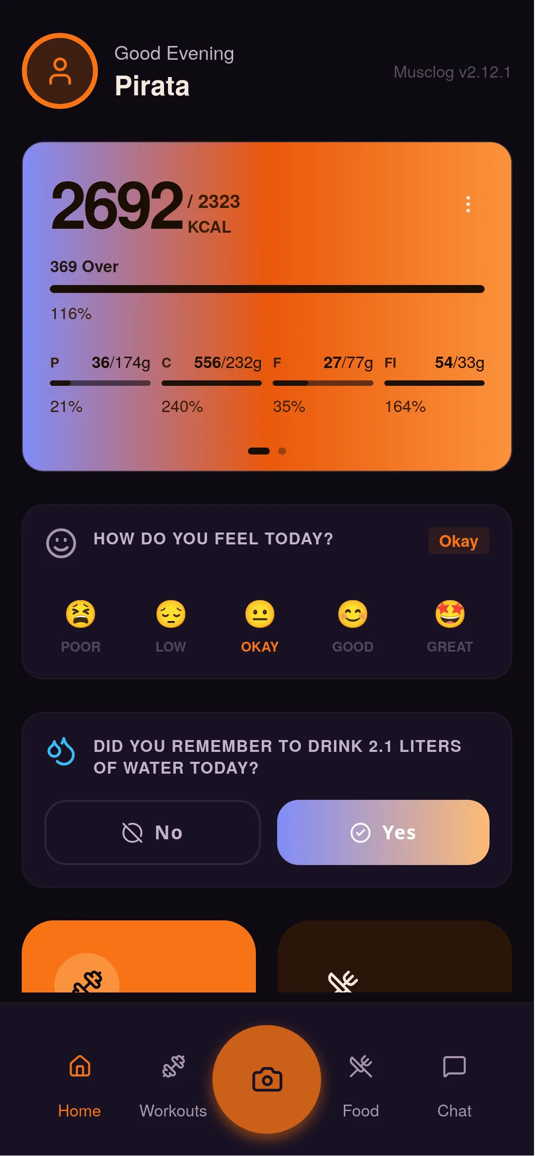
It is a dark theme on violet surfaces with an orange accent, and adding it was one object in theme.registry.js, one entry in the picker, and a line of copy per language. No new CSS map, no new native variable map, no component learning that a sixth palette exists, and no test naming it. The contrast matrix picked it up on its own, because the matrix iterates the registry rather than a list of theme names I have to remember to extend. Its summary card carries a bright orange sweep, which is the Kinetic Volt situation again — and the rule generalized away from Volt, that the card’s ink must sit on one side of the whole gradient, was already waiting.
That is the whole return on the refactor. The first five themes cost me a rewrite. The sixth cost me an afternoon of choosing hex values.
Four colors per theme?
Musclog also has a Game Boy Color edition — a real .gbc ROM with onboarding, macro tracking, and workout logging. It has no theme.ts, no NativeWind, and no concept of a CSS variable. It looked like the one place a theme could not follow.
It followed anyway, because by then the registry was plain data that anything could read.
The phone app paints from around thirty colors per theme. The Game Boy Color draws its whole text UI from four background palettes of four colors each, and the font only ever touches color 0 (the cell background) and color 3 (the glyph ink). So porting a theme is a reduction to four background/ink pairs, one per palette slot:
const SLOTS = [
  { name: 'NORMAL', background: 'surfaceBase' }, // the screen itself
  { name: 'HEADER', background: 'brandSurface' }, // the title strip
  { name: 'SELECTED', background: 'brandBright' }, // the focused row
  { name: 'PANEL', background: 'surfaceAccent' }, // cards, bars, value chips
];
The ink is the interesting half. It cannot be a fixed token: textPrimary is the right ink on a light theme’s surfaces and inkOnAccent is the right ink on its brand fills, and the two swap roles in a dark theme. Picking whichever of the pair contrasts more with the chosen background gets every slot right in every theme, with no per-theme table:
const inks = [parseHex(palette.textPrimary), parseHex(palette.inkOnAccent)];
const ink =
  contrastRatio(background, inks[0]) >= contrastRatio(background, inks[1]) ? inks[0] : inks[1];

return [background, mix(background, ink, 1 / 3), mix(background, ink, 2 / 3), ink];
That is the text.black rename paying off in a language with no theme system at all. A name describing the role survived the trip down to four colors; a name describing the hue would not have.
npm run gb:gen-themes writes src/generated/themes.{c,h}: the palette table, a theme count, a default index read from DEFAULT_THEME_BY_MODE.dark, and short uppercase labels derived from the ids — kinetic-volt becomes VOLT. The generator throws if a label exceeds eight characters, because that is what the settings row’s value column fits. A naming mistake is a build failure rather than a truncated word on a real screen.
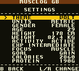
THEME leads the settings list on the cartridge because it is the one row that changes the screen as you scroll through it. LEFT/RIGHT cycles the value, ui_theme_set uploads the four palettes immediately, and the screen you are already looking at recolors in place. The choice is a display preference rather than profile data, so it lives in its own small SRAM store outside the checksummed save block: it survives a NEW GAME erase and exists before onboarding has produced a save at all.
The test guarding this does not check colors at all. It checks that the generated table lists the same ids as the registry, in the same order, because the byte stored in SRAM is an index. Appending a theme is safe; reordering one would silently repoint every existing cartridge at a different palette.
Adding a seventh theme is now one object in theme.registry.js and a re-run of the generator. The cartridge never learned any of their names.
Musclog now has six themes. More importantly, it has one theme system.
