I lost my app icon, so now a script draws six of them
I recently added themes to Musclog. As usual, one decision I made a while ago came back to cause me problems later.
The decision was how I made the app icon. I made it exactly once, in Photopea, on top of an app-icon background I found online. I exported a PNG, put it in assets/, and moved on. I didn’t keep the .psd or note which background it was. I didn’t write down the font size or the gradient stops either. The PNG was the only thing left.
That was fine for a long time. Then the app got six themes: Kinetic Depth, Light, Shock, Volt, Blush and Varia. The obvious next step was an icon to match each one, and I had no way to make even one more.
I could have opened Photopea again and redrawn the icon six times by eye. I’ll call that vibe-designing. It works once. It doesn’t work for the seventh theme, or for a theme whose colours get changed next month, or for keeping six hand-made files consistent. So I stopped thinking of the icon as a picture and started thinking of it as a recipe.
An icon is three layers
The original icon is a rounded, glassy button with a gradient fill and the wordmark on top. Once you split it apart, there are only three parts:
- A shape. The rounded square, with nothing else.
- The lighting. The bevel, the inner highlight along the top edge, the soft shadow at the bottom. This is what makes it look like glass instead of a flat sticker.
- The wordmark. “Musclog” and “LIFT, LOG, REPEAT”.
The colour isn’t one of those parts. That’s the useful insight: the only thing that should change between themes is the fill colour, so it shouldn’t be baked into any of the source files.
So I made the three layers separately:
- The shape is a flat gray rounded square on a transparent background. I only use its outline; the gray itself is never used.
- The lighting came from Gemini. I asked it for a transparent PNG with only the highlights and shadows of a glossy app-icon button, and no colour at all. White where light hits, dark where it doesn’t, and fully transparent everywhere else. This was the part I couldn’t easily draw myself, and the part where a generated image is a good fit: it never has to match a brand colour, because it has none.
- The wordmark is the logo text set in Gilroy Free, white with a small drop shadow, again on a transparent background.

All three are 1254×1254 and line up pixel for pixel. Anything that touches colour happens in code.
Painting the shape from the theme
The themes already live in one plain-JavaScript registry, theme.registry.js. I wrote about how it ended up that way in the light-mode post. Every theme has a primitive palette, and two of its colours make a good gradient for the icon: brandBright at the top and statusInfo at the bottom.
The script, scripts/generate-theme-icon-backgrounds.js, reads the gray silhouette’s raw pixels with sharp. It replaces the colour of every visible pixel with a gradient sampled from the theme:
const RECOLOR_STOPS = [
  { at: 0, token: 'brandBright' },
  { at: 1, token: 'statusInfo' },
];

function recolorPixels(data, width, height, palette) {
  // ...find the first and last rows that contain any visible pixel...
  for (let y = 0; y < height; y += 1) {
    const position = (y - firstVisibleRow) / visibleHeight;
    const color = interpolateColor(stops, clamp(position));
    for (let x = 0; x < width; x += 1) {
      const offset = (y * width + x) * 4;
      if (data[offset + 3] === 0) continue; // transparent stays transparent
      data[offset] = color[0];
      data[offset + 1] = color[1];
      data[offset + 2] = color[2];
      // alpha is left alone, so the anti-aliased edge survives
    }
  }
  return data;
}
Two details matter here.
The gradient is measured from the shape, not from the canvas. The rounded square doesn’t fill the 1254px image; there is transparent margin around it. If the gradient ran from row 0 to row 1253, the visible part of the button would only show the middle of it, and both stop colours would be lost in the margin. Measuring from the first visible row to the last puts brandBright exactly on the top edge and statusInfo exactly on the bottom.
The gray value is ignored completely. Only the alpha channel is used, so the silhouette is just a stencil. If its shade leaked into the fill, every theme would inherit the same tint from a file that is supposed to have no colour, and a test checks that a pixel’s original shade has no effect on its new colour.
After that it’s ordinary compositing: lighting over the fill, then text over both.
await sharp(pixels, { raw: { channels: 4, width, height } })
  .composite([
    { input: glassEffectPath, blend: 'over' },
    { input: textPath, blend: 'over' },
  ])
  .png()
  .toFile(`assets/theme-icons/icon-bg-${themeId}.png`);
The loop runs over THEME_IDS, so the script needs no list of themes of its own. Adding a theme to the registry and running npm run generate-theme-icon-backgrounds is all it takes to get its icon.
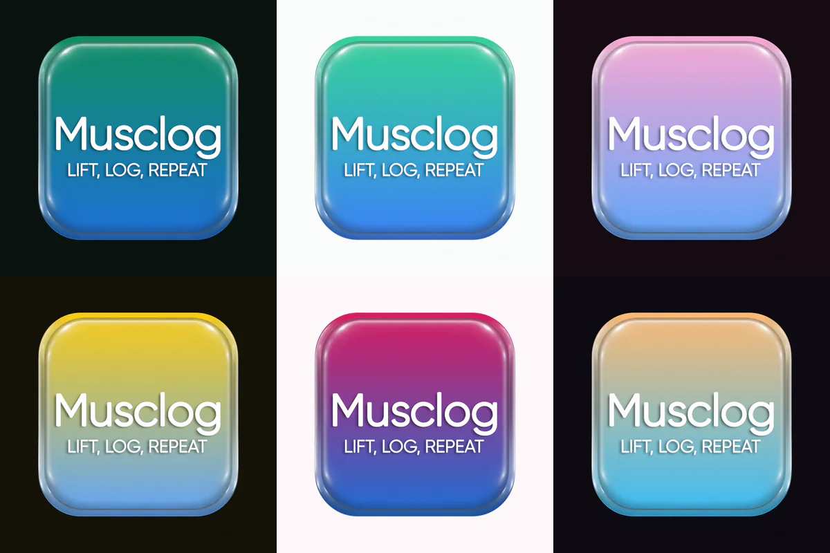
iOS does not want your transparency
The generated icons have transparent corners, because the glassy button has its own rounded edge and drop shadow. Android is fine with that: an adaptive icon is a transparent foreground layer over a background colour, and the launcher applies its own mask.
iOS isn’t. App icons there must be fully opaque, and a transparent icon gets flattened onto whatever colour the toolchain chooses. So the same script now writes a second copy of every icon, flattened onto that theme’s own surfaceBase:
await sharp(outputPath)
  .flatten({ background: themeIconBackgroundColor(themeId) })
  .png()
  .toFile(path.join(opaqueDirectory, `icon-bg-${themeId}.png`));
The same colour also becomes the Android adaptive icon’s background, so both platforms show the button on the same backdrop.
Then I wanted the icon to follow the theme
Once there were six icons, picking Kinetic Volt in the app and still seeing an emerald icon on the home screen felt wrong. Both platforms can change the launcher icon at runtime, with one strict condition: every possible icon has to be compiled into the app ahead of time. You can’t hand the OS a PNG at runtime.
Before writing any code, I settled three rules.
Only a manual theme change switches the icon. Nothing in the app runs when the phone boots, or when the OS switches from light to dark at sunset. The icon can only react to a choice the user makes inside the app.
“System” keeps the default icon. The System theme follows the OS’s light or dark setting, and that can change while Musclog isn’t running, so the icon could never keep up with it. The default icon is the honest answer.
There’s one file for all of it. constants/themeAppIcons.js decides that the default dark theme is the default icon, that every other theme is an alternate named after its id (kinetic-volt → KineticVolt), and that system maps to the default. It’s CommonJS for the same reason the theme registry is: the build step that generates the native icons runs in Node and has to follow exactly the rules the app follows at runtime.
The library that would have broken my widgets
Normally I’d install expo-alternate-app-icons, and on iOS it would have been fine. Reading its Android code showed a problem first.
On Android, switching icons is done with activity-alias entries. Each alias is another launcher entry pointing at the same activity, with its own icon, and you enable one and disable the rest. The library decides which component to disable by asking which component launched the current screen. When the default icon is showing, the answer is MainActivity itself, so it disables MainActivity.
In this app, MainActivity handles much more than the launcher tap. It holds the com.werules.logger:// intent filter, which both home-screen widgets use to open the app. It also holds the filter Health Connect uses to show the permissions screen. Disabling it would have broken both, and you’d only find out when someone tapped a widget.
So I wrote a small local Expo module instead, with a config plugin that changes the manifest as follows:
MainActivitykeeps every intent filter except MAIN/LAUNCHER, and is never disabled.- The launcher entry moves onto aliases:
.LauncherIconDefault, which is enabled, plus one disabled alias per alternate theme.
<activity-alias
    android:name=".LauncherIconKineticVolt"
    android:enabled="false"
    android:exported="true"
    android:icon="@mipmap/ic_launcher_kinetic_volt"
    android:roundIcon="@mipmap/ic_launcher_kinetic_volt_round"
    android:targetActivity=".MainActivity">
  <intent-filter>
    <action android:name="android.intent.action.MAIN" />
    <category android:name="android.intent.category.LAUNCHER" />
  </intent-filter>
</activity-alias>
The Kotlin side only ever touches components whose name starts with LauncherIcon. It enables the new alias before disabling the old ones, so there’s never a moment with no launcher entry at all:
if (!isEnabled(context, target)) {
  packageManager.setComponentEnabledSetting(
    ComponentName(context.packageName, target.name),
    PackageManager.COMPONENT_ENABLED_STATE_ENABLED,
    PackageManager.DONT_KILL_APP
  )
}
for (alias in aliases) {
  if (alias.name != target.name && isEnabled(context, alias)) {
    packageManager.setComponentEnabledSetting(
      ComponentName(context.packageName, alias.name),
      PackageManager.COMPONENT_ENABLED_STATE_DISABLED,
      PackageManager.DONT_KILL_APP
    )
  }
}
The same plugin builds the Android resources for each alternate theme: a foreground PNG at every density, an adaptive-icon XML, and its background colour. On iOS it writes an AppIcon<Name>.appiconset for each one from the opaque artwork, and sets ASSETCATALOG_COMPILER_ALTERNATE_APPICON_NAMES so Xcode compiles them as alternate icons. Everything comes from ALTERNATE_APP_ICON_THEME_IDS, so a new theme gets its native icons the next time I run prebuild.
Two platforms, two different catches
Android: don’t switch while the user is looking. DONT_KILL_APP keeps the process alive, but some launchers, Pixel’s among them, close the app’s task or remove its home-screen shortcut when the alias that launched it is disabled. Doing that while the user is in the middle of the settings screen is exactly the wrong moment. So on Android, picking a theme only records the icon it wants, and the switch happens the next time the app goes to the background:
if (Platform.OS === 'android') {
  pendingAndroidIcon = name;
  ensureBackgroundSubscription(); // applies it on AppState 'background'
  return;
}
await applyAppIcon(name).catch(reportFailure);
Only the latest pick waits. Going from Light to Blush to Volt in one session switches the launcher once, to Volt.
iOS: there’s always an alert. setAlternateIconName makes iOS show “You have changed the icon for Musclog” every time, and there’s no public way to stop it. I can’t avoid the alert, but I can avoid showing it for nothing: the service checks the current icon first and does nothing if it’s already right. Choosing the theme you’re already on doesn’t show a popup.
In both cases a failed switch is reported to Sentry and the old icon stays. A missing icon isn’t a reason to throw an error into the settings screen.
What I’d tell my past self
Keep the layers, not the export. A flat PNG is a result, not a source. I lost the Photopea file, but if I had kept it, I’d still have had a file I could only edit by hand. What I really lost was the ability to make a seventh icon without thinking about it.
The recipe I have now is three PNGs that have no colour and no theme in them, and one function that knows how to fill a stencil. The layer I couldn’t draw came from an image model, and that works because I asked for the one part that never needs to match anything. The colours come from the same registry the rest of the app reads, so the icon can’t drift from the theme it represents.
The next theme will cost one object in theme.registry.js, one run of the generator and one prebuild. That’s the same price as the theme itself, and it’s what I wanted.
